Tellycom
Booking App.
Tellycom?
A two-sided app for hosts who teach and guests who book — across iOS, Android, and web.
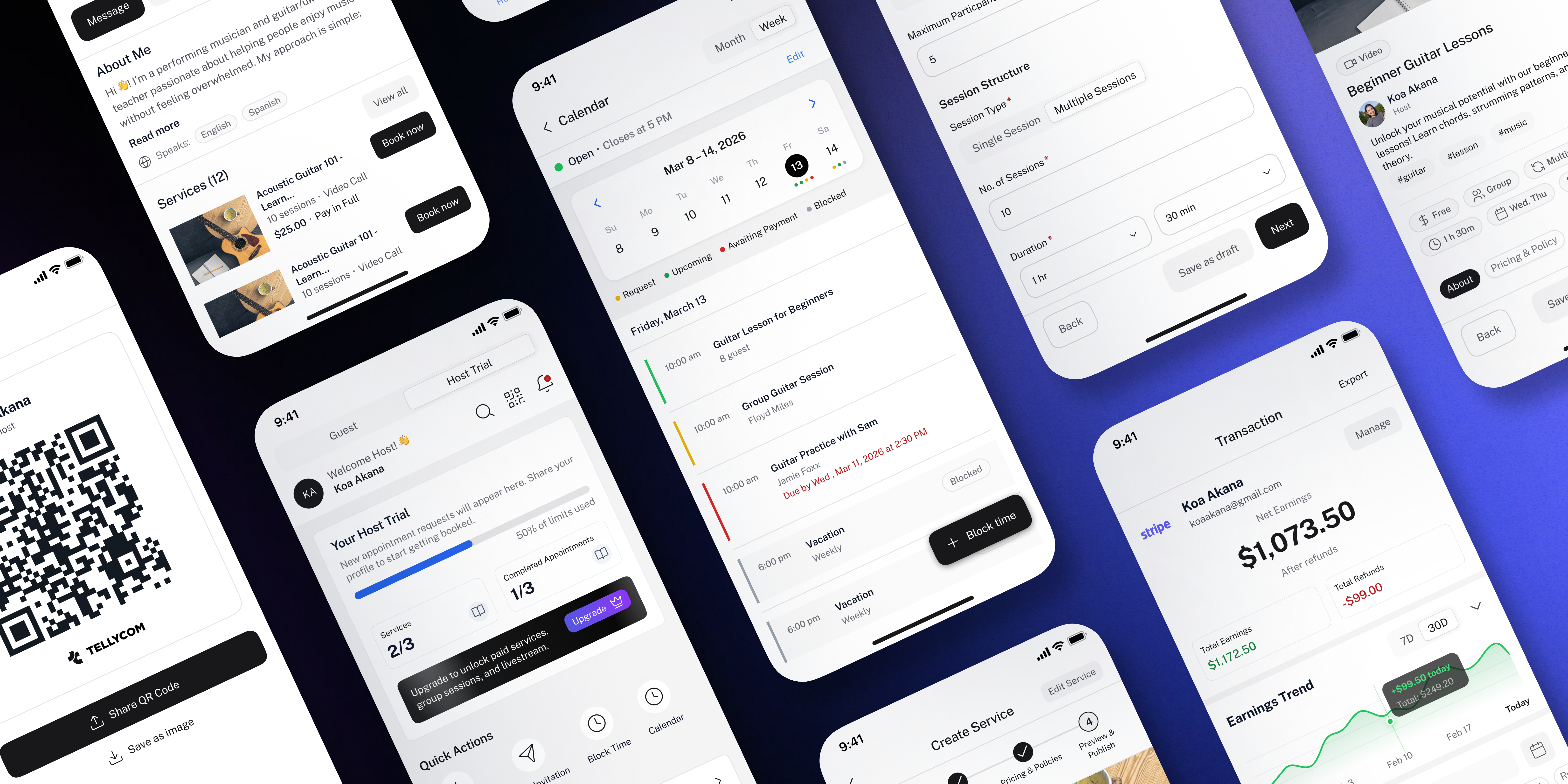
Tellycom is a two-sided booking app — hosts create and publish their services, guests browse and book them. A host can offer anything from a 1-on-1 coaching call to a group workshop to a live-streamed class. Sessions run as Audio, Video, In-person, or Livestream. Guests see the host's profile, pick a slot, and book. The host approves it manually.
I came in as the sole designer with a blank Figma file. No inherited components, no existing design system, no prior screens to reference. I set up the file structure, built the design system from scratch, and designed every screen across both sides of the product.
100+ screens across iOS, Android, and web — designed as one cohesive system. Two completely different user experiences (host and guest) that needed to feel like they came from the same product.
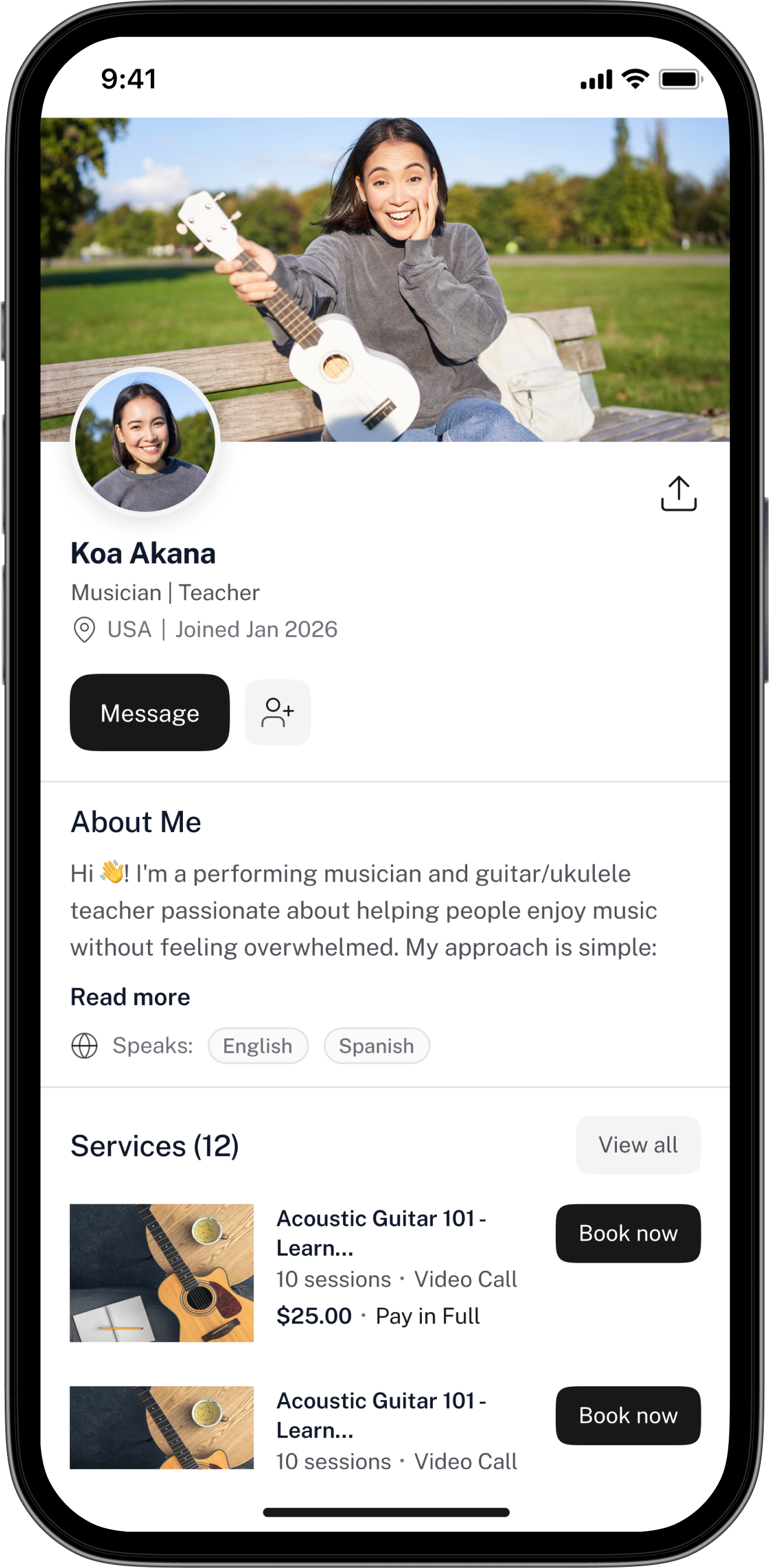
The Host
A coach, teacher, or practitioner who wants to offer paid or free services under their own brand — without the overhead of running a full business setup.
The Guest
A learner, client, or curious person looking to book a session with someone who has the skill or knowledge they need — quickly and with confidence.
broken.
Independent hosts have the skill. Guests have the need. There was no simple way to connect the two.
Independent hosts — coaches, tutors, trainers, practitioners — have skills people want to book. But managing services, handling payments, and coordinating schedules across DMs, spreadsheets, and third-party tools is slow, error-prone, and unprofessional.
On the guest side, finding and booking an independent expert means hunting across platforms, messaging back and forth to confirm availability, and paying through informal channels with no clear refund policy or booking record.
"Hosts needed a business tool that felt effortless. Guests needed a booking experience that felt safe and clear."
Tellycom solves this by giving hosts a single place to create services, manage their calendar, track earnings, and communicate with guests — while giving guests a fast, transparent way to discover, book, and pay for sessions they trust.
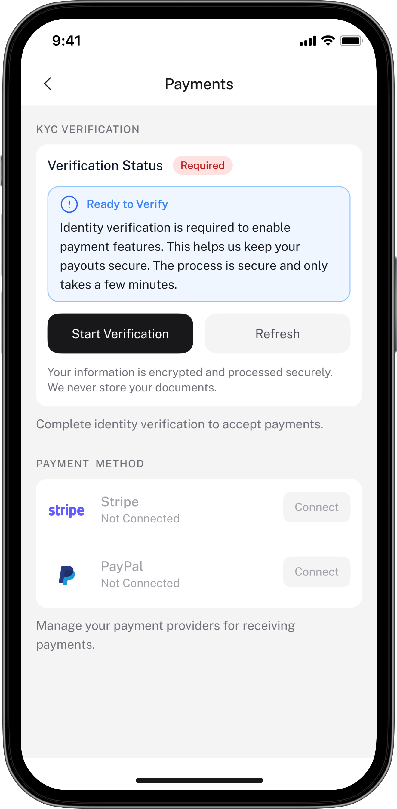
The app also handles a real-world complexity: hosts can only accept paid bookings once they've reached Host Premium, passed KYC verification, and connected a payment provider. Tellycom guides hosts through that progression without making the app feel limited before they get there.
Map both sides before touching a screen
Started by mapping out every feature the stakeholders needed — for both host and guest. Even without a finalised spec, this gave me a rough picture of what had to exist and how the two sides connected. Knowing the full scope early meant fewer structural surprises later.
Design system before screens
Set up the full Figma file structure, then built the design system — colour tokens, typography scale, spacing, elevation, and core components. Every screen that followed pulled from this library. Consistency across 100+ screens wasn't enforced later — it was built in from the start.
Host flows first, then guest
The host side is the more complex half — service creation, scheduling, pricing, approvals, earnings. Designing host flows first gave me a clear understanding of what data and logic the guest side needed to surface. Guest screens came second, informed by what hosts were actually able to create.
Iterate as requirements solidified
A lot of screens were revisited as the business logic became clearer. Designs I'd completed had to be updated when rules around payments and host tiers were finalised. Rather than fighting this, I built in flexibility early — locking down what was certain and keeping ambiguous sections loosely structured until clarity arrived.
UI told
the wrong
story.
One widget on the Trial dashboard was creating confusion that users had to stumble through on their own.
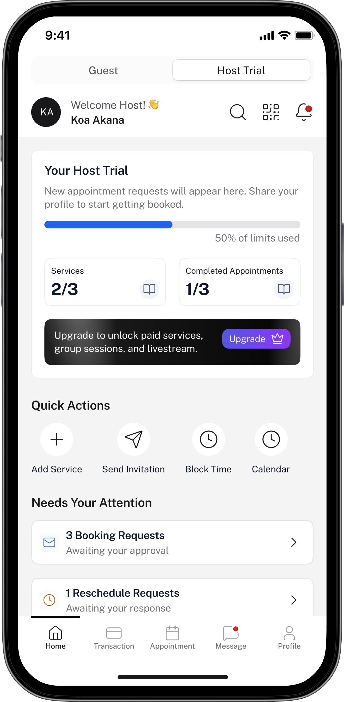
The original Host Trial dashboard had a Monthly Earnings card — showing $00 by default. The problem: Trial hosts can't receive payments at all. They can only publish free services. Paid services are off the table until they upgrade to Premium, complete KYC verification, and connect a payment provider.
That one widget silently misled users. A new host would see "Monthly Earnings: 00" and assume they just hadn't earned yet — not that the feature didn't exist for their tier. They'd go looking for why, or worse, try to set up a paid service and hit an invisible wall.
"Don't show what doesn't apply. Don't make users discover your limits through confusion."
The fix wasn't visual — it was informational
The old design wasn't ugly. It just surfaced the wrong data for the context. Trial hosts have three hard limits: up to 3 published services, up to 3 completed appointments, and no paid services. The new dashboard makes all three visible at a glance. Users know exactly where they stand, what they can still do, and what upgrading unlocks — without discovering any of it by accident.
Dashboard
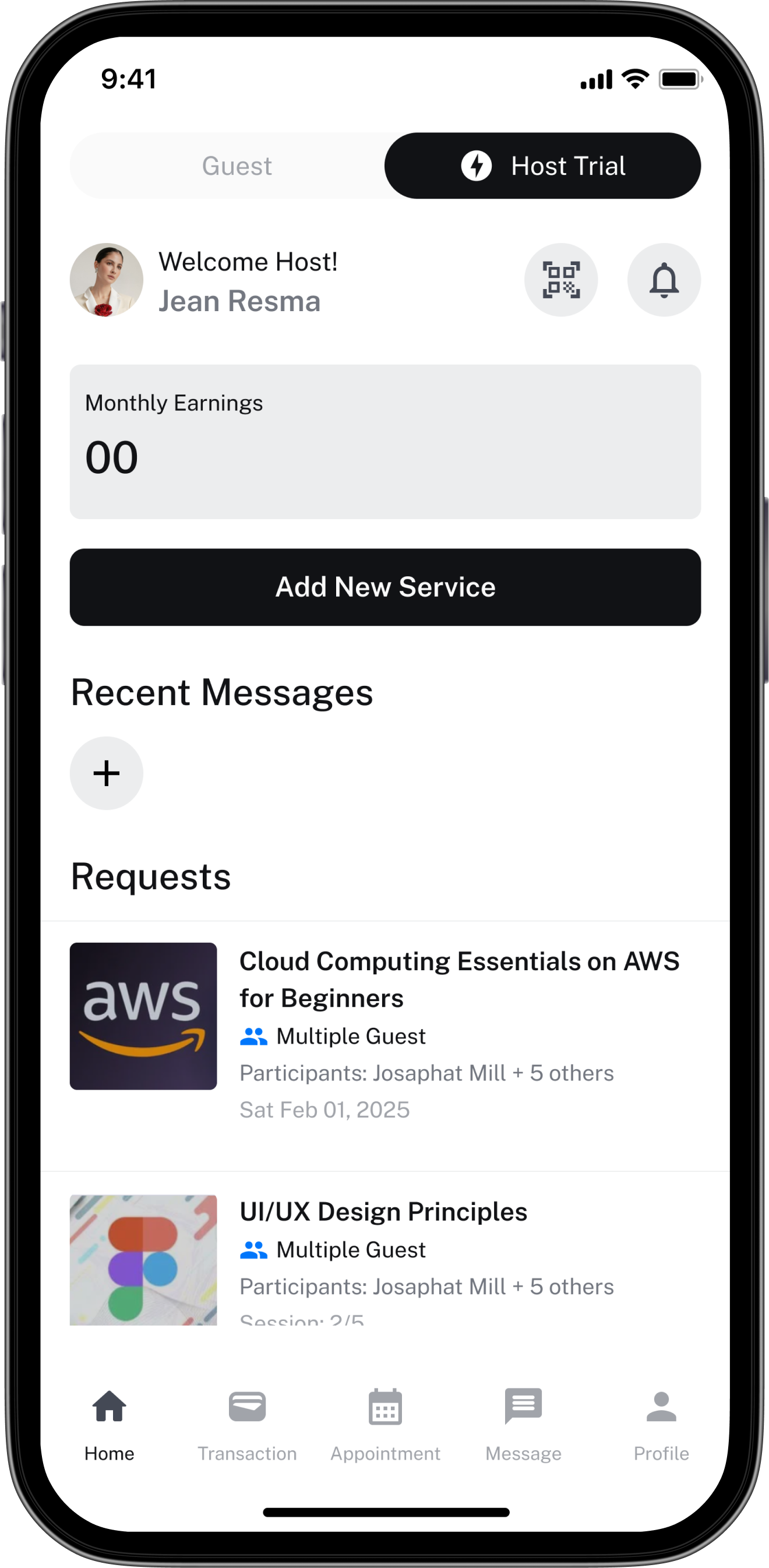
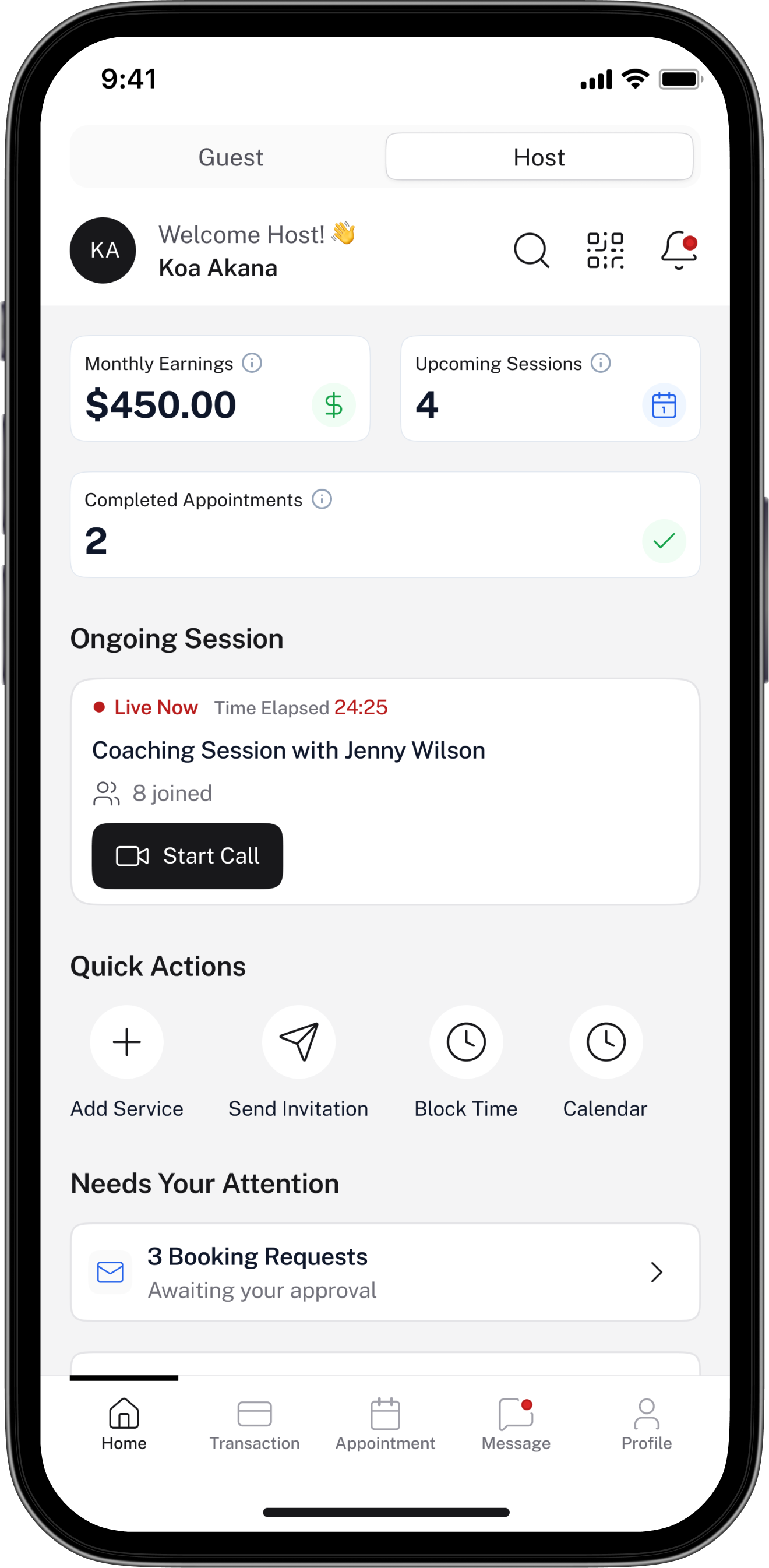
The dashboard bifurcates based on host tier. Trial hosts see usage limits and an upgrade path — the experience is complete, not broken. Premium hosts get full visibility: monthly earnings, upcoming sessions, a live session widget, and booking requests needing action.
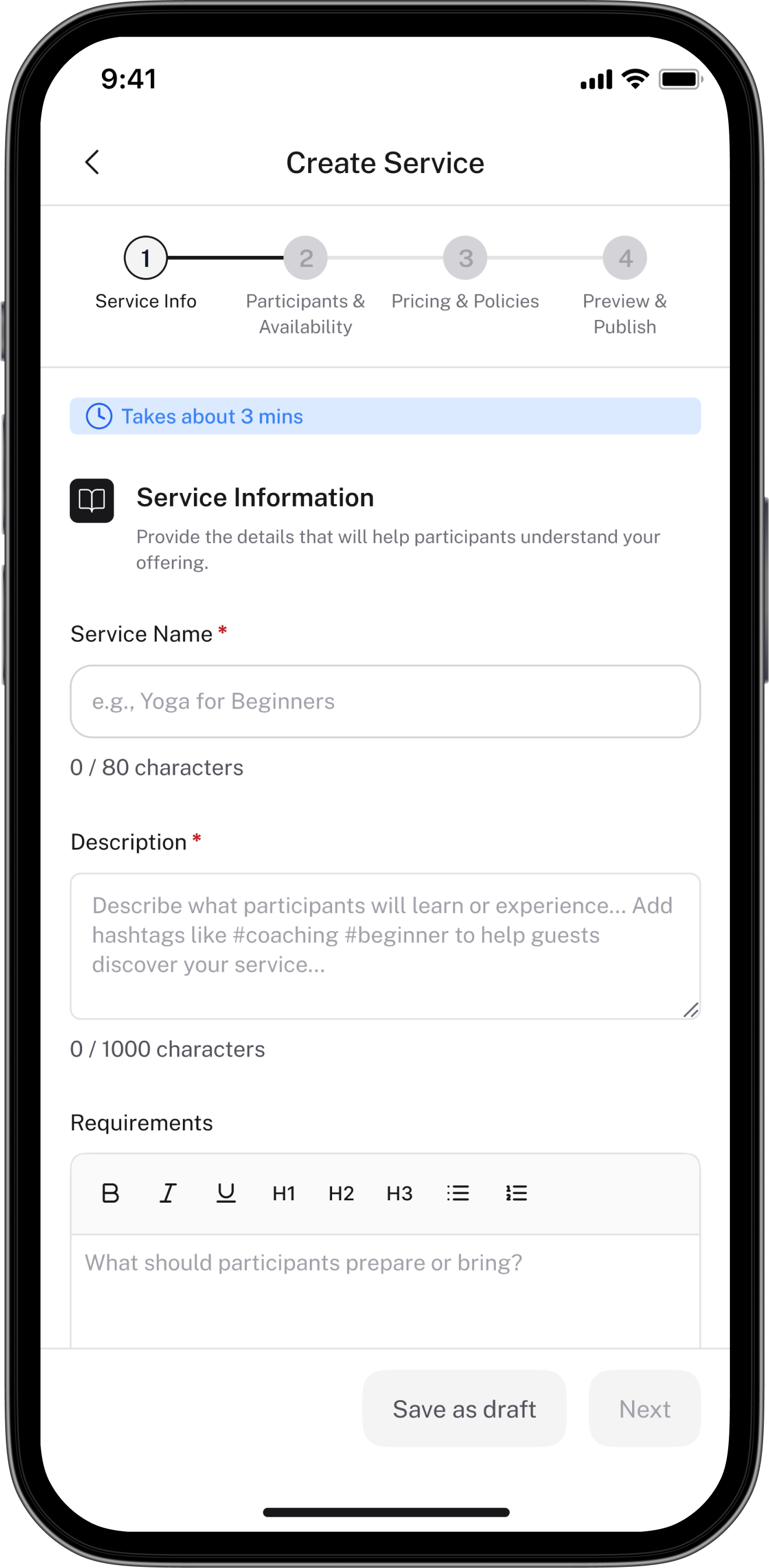
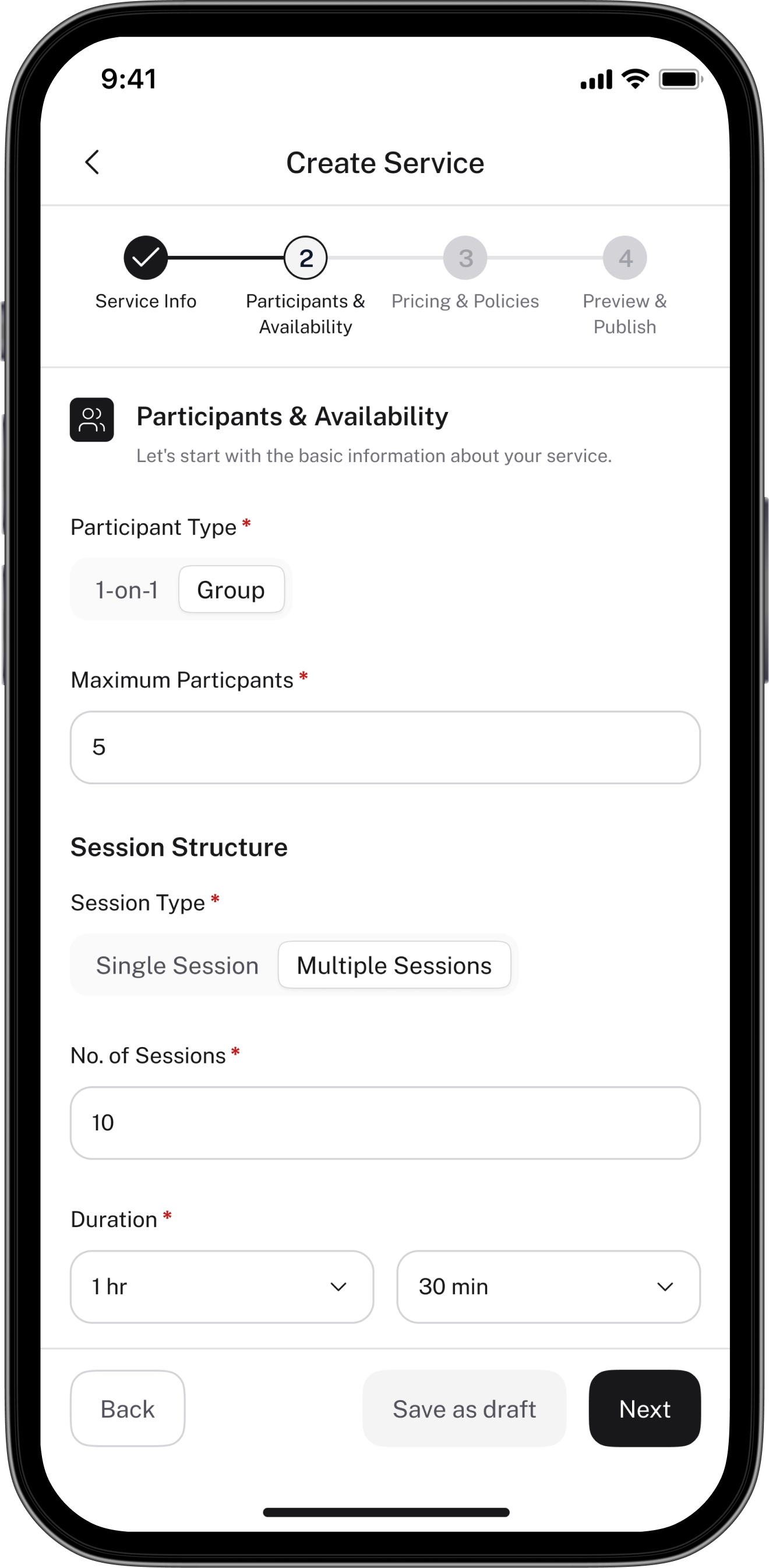
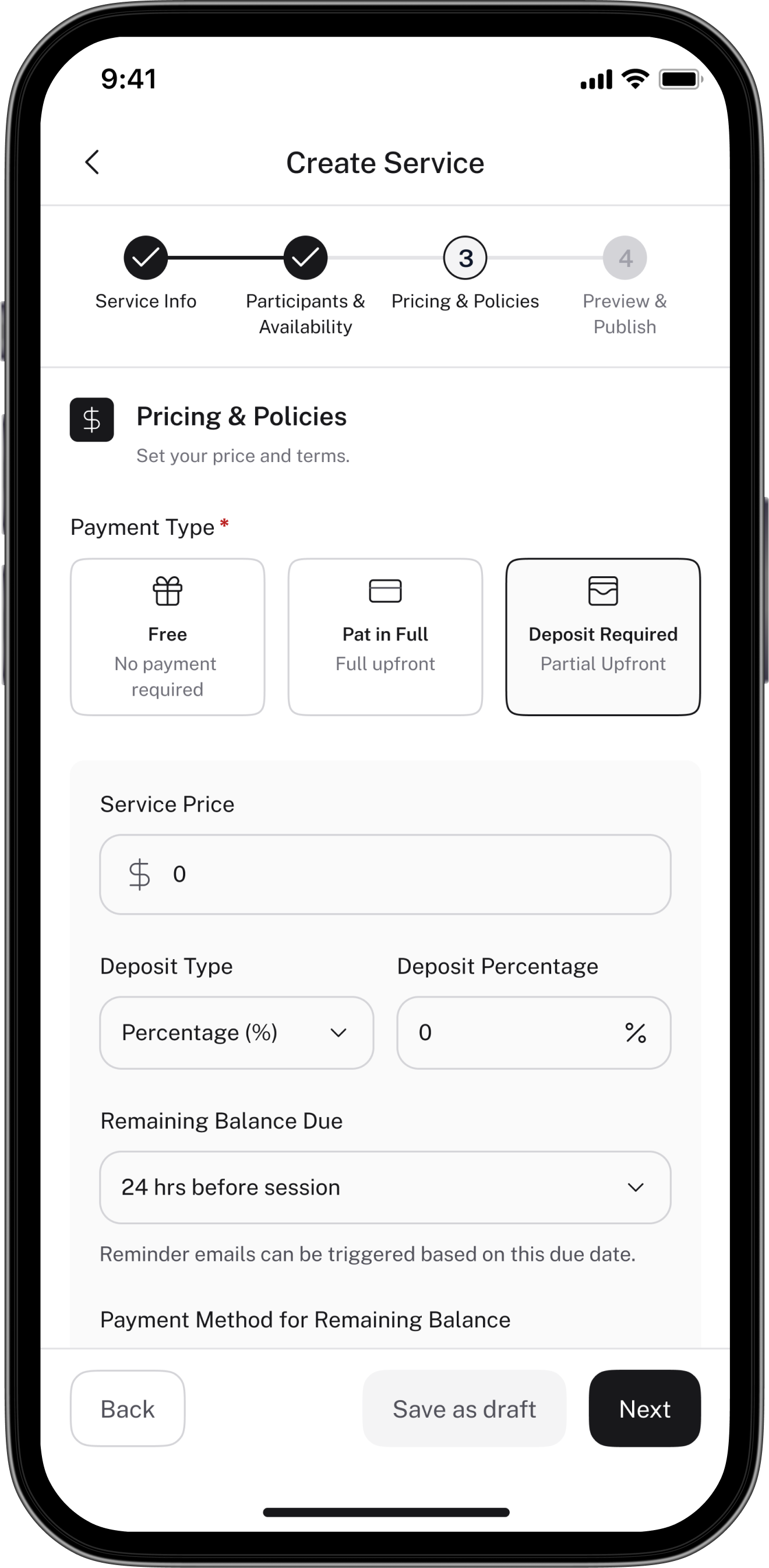
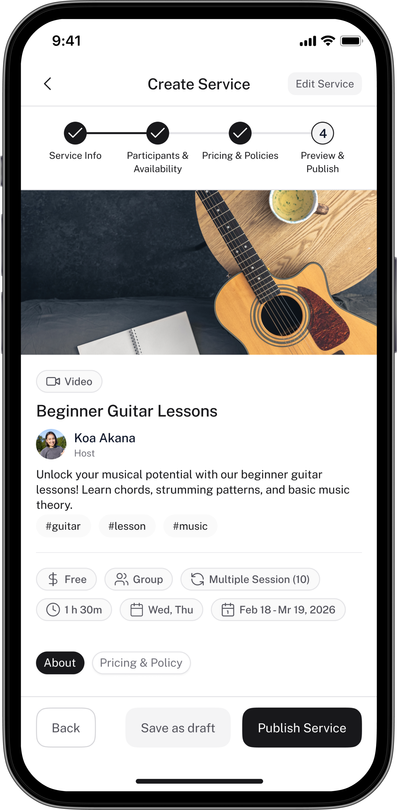
Creation
A 4-step flow: Service Info → Participants & Availability → Pricing & Policies → Preview & Publish. Each step is focused and builds on the last. The "Takes about 3 mins" label at the top sets expectations and reduces drop-off before hosts even begin.
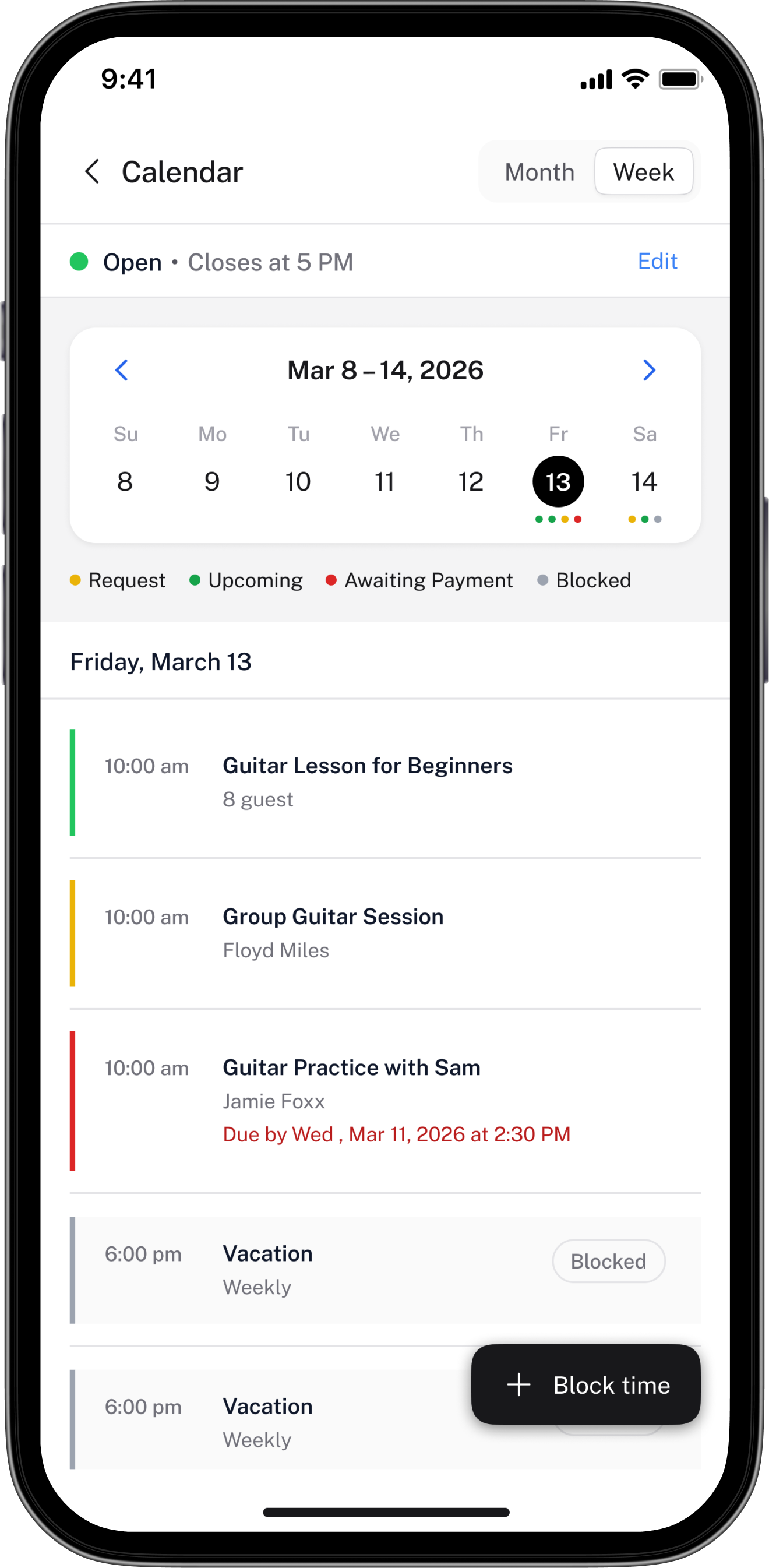
Calendar
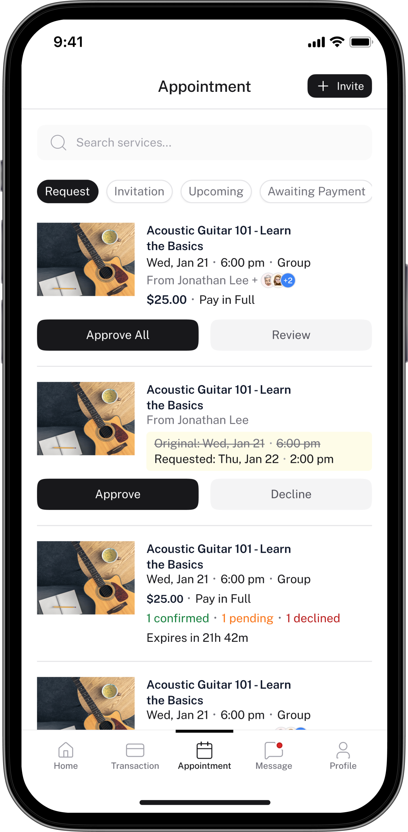
Hosts see all upcoming and past sessions in one place. The calendar gives a time-based view; the appointments list shows status at a glance. Booking requests that need approval surface at the top of the dashboard.
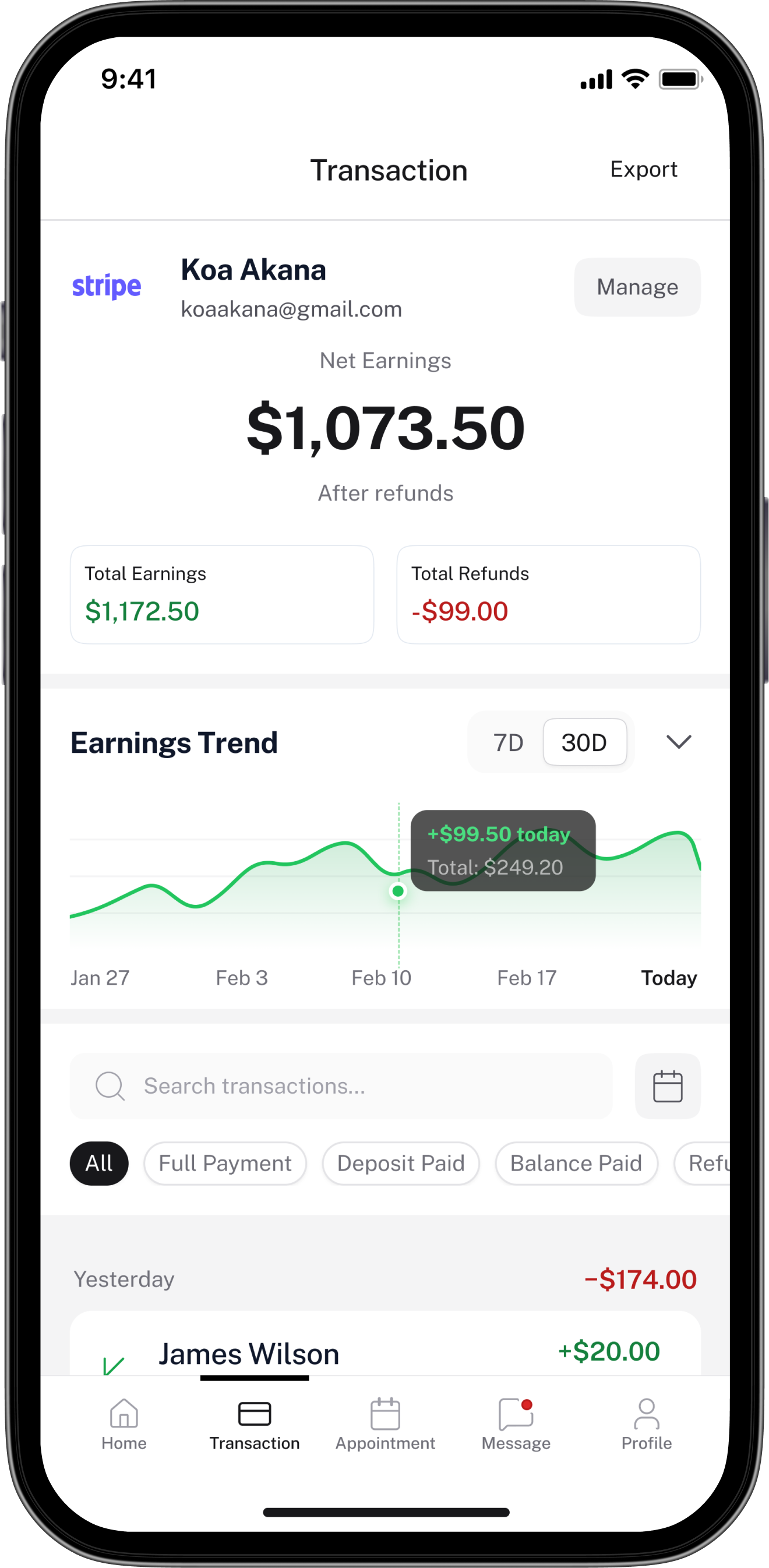
Tellycom doesn't hold funds — money goes directly to the host's PayPal or Stripe. The transaction screen records and displays all earnings activity: net earnings after refunds, an earnings trend chart, and a full transaction list showing Full Payment, Deposit, Balance, Tip, Refund, and Cancelled states.
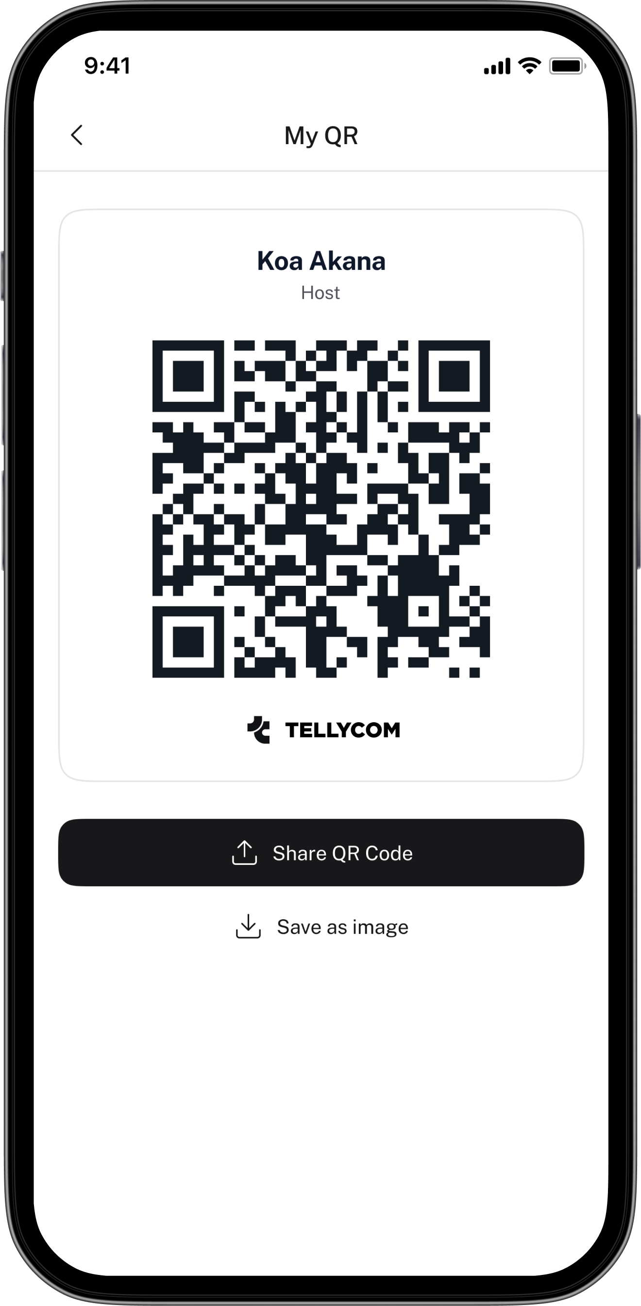
QR Code
Hosts can share their public profile via a unique QR code. Guests who scan it land directly on the host's profile and service list — reducing friction between discovery and booking, especially for hosts who market themselves offline or through other channels.
A 4-step stepper that tells hosts "takes about 3 mins"
Service creation covers a lot of ground: name, description, requirements, gallery, session format, schedule, pricing, refund policy, and a full guest-facing preview. Putting all of that on one screen would have been overwhelming. I broke it into four focused steps — Service Info, Participants & Availability, Pricing & Policies, and Preview & Publish. The "Takes about 3 mins" label at the start sets expectations and reduces drop-off before hosts even begin. Each step builds logically on the last, so nothing feels out of place.
Two completely separate dashboards — not one with locked states
Trial hosts and Premium hosts have fundamentally different experiences. Trial is limited: 3 services max, limited appointments, no group sessions, no paid services. Instead of showing Premium hosts a locked-down version of their full dashboard, I designed two distinct dashboard experiences. Trial gets usage limits with a clear progress bar (2 of 3 services used) and an upgrade CTA. Premium gets the full view — monthly earnings, upcoming sessions, a live session widget, and booking requests that need attention. This made both experiences feel intentional rather than one feeling like a broken version of the other.
A warning, not a block — publishing even with incomplete payment setup
Paid services require three things to go live: Host Premium subscription, completed KYC verification, and a connected payment provider (PayPal or Stripe). The question was: should we block publishing if any of those are missing? We decided no. A host can still create and publish a service even with incomplete payment setup — they just see a warning banner explaining that the service won't be bookable for paid guests until all three conditions are met. This respects the host's time and progress while being transparent about what's still needed, rather than putting up an abrupt wall.
Refunds are requested in-app but processed by the host manually
Because Tellycom doesn't hold funds — money goes directly to the host's PayPal or Stripe — the app can't process refunds automatically. When a guest requests a refund, it's logged in-app and the host is notified to handle it manually through their payment provider. This required clear in-app language so guests understood what "requesting a refund" actually means on this platform — it's a request to the host, not an instant reversal. Designing this communication clearly, without making the guest experience feel unsafe, was a careful balancing act.
Designing while requirements were still being written
There was no single source of truth when the project started. Business rules — around payments, refunds, host tiers, and booking approval logic — were being defined in parallel with the design. This isn't unusual, but it meant a lot of screens had to be revisited once decisions were finalised. I started designing in layers: locking down what was confirmed, keeping the ambiguous parts loosely structured, and revisiting those areas as clarity arrived. It made iteration faster and less painful when things inevitably changed.
Every host decision affects the guest experience
The host and guest sides aren't independent — they're tightly linked. The fields a host fills in during service creation are the same information a guest sees when browsing. The session modes a host sets up determine what a guest can choose when booking. I had to hold both perspectives simultaneously rather than designing them in isolation. Any time I made a decision on the host side, I had to immediately think through what that meant on the guest side.
Making the 3-condition payment gate feel clear, not punishing
A host can only charge guests for their services if they have Premium, completed KYC, and connected a payment provider. Getting all three of those things done isn't instant. The challenge was communicating this gate without making the app feel broken for hosts who are mid-setup. The warning banner approach — letting them publish while clearly surfacing what's still needed — took several iterations to get the tone right. Too strict felt like a blocker; too casual felt like the app might let a paid booking slip through.
Making Trial feel complete, not broken
Trial hosts have real limitations — a cap on services, no paid offerings, no group sessions or livestream. The risk was that the Trial experience would feel like a broken version of Premium. The solution was to design the Trial dashboard as its own complete experience: the limitations are surfaced clearly (usage progress bars, plan labels), the upgrade CTA is present but not aggressive, and the features that are available work fully and well. Trial should feel like a product that works, not a product with things missing.
from day one.
Every screen in Tellycom is assembled from the same set of components — colours, typography, spacing, and elevation defined as tokens. New screens take a fraction of the time. Consistency is guaranteed, not checked.
Design in layers when the spec isn't ready
When requirements are still being decided, don't wait — and don't over-commit either. Lock down the parts that are certain, keep the ambiguous areas flexible, and design with the assumption that some things will change. It's not chaos; it's just how real product work happens.
Two-sided apps need one design brain holding both sides
Host and guest screens aren't separate projects — every host decision lives on the guest side too. Keeping both perspectives active simultaneously, rather than switching between them, is what makes a two-sided product feel cohesive rather than split.
Tier-based products need tier-based design thinking
Designing a premium vs. trial experience isn't just about locking features. It means designing two distinct contexts that each feel complete and intentional — not one experience that looks broken compared to the other.
When the business logic is complex, make the UI simple
The 3-condition payment gate is legitimately complicated. But a user shouldn't need to understand how it works — they just need to know what to do next. The designer's job in a complex system is to hide the complexity without hiding the meaning.